Art for Large Walls: Choosing Fine Art Photography with Zack Zublena

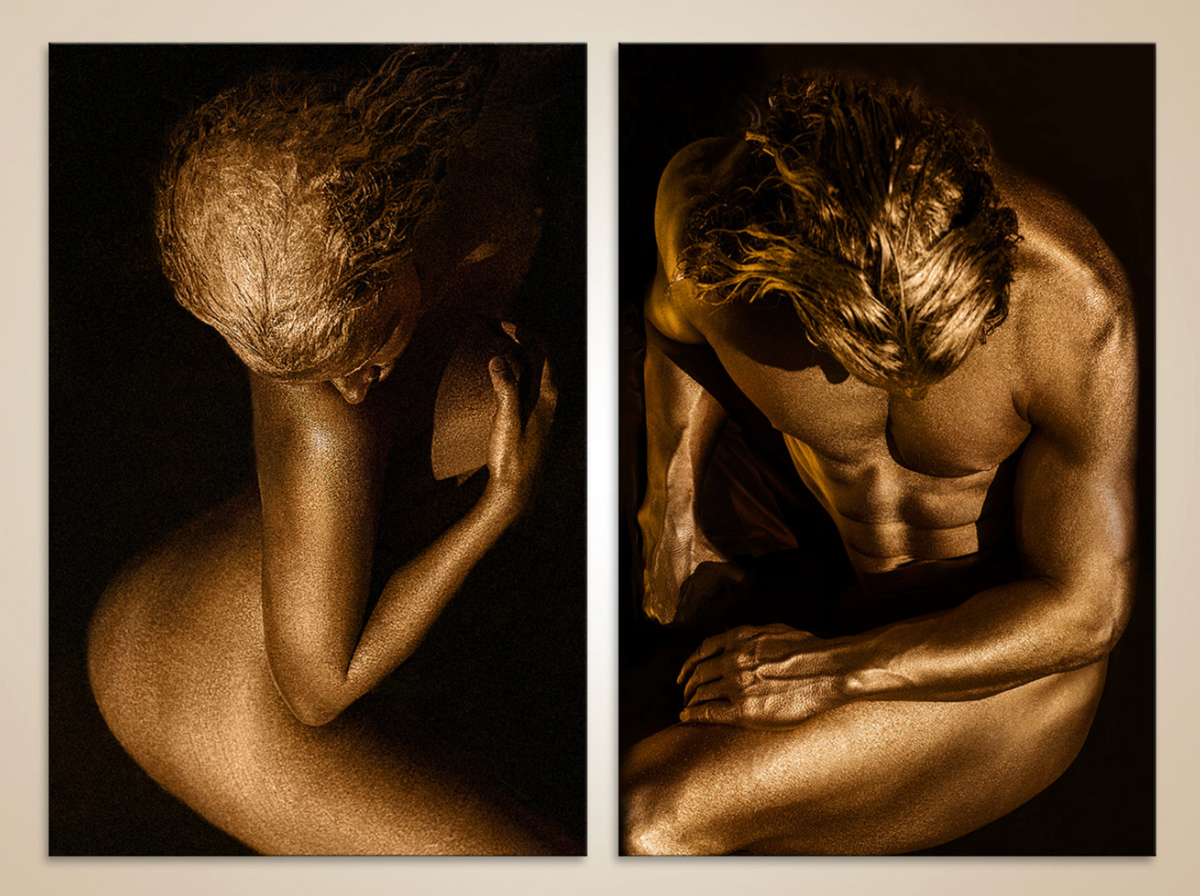
Golden Couple Diptych by Zack Zublena. Two individual compositions create a shared rhythm through golden tones, contemplative gestures, and dark backgrounds. Discover the artwork.
A large wall offers possibility, but its dimensions alone do not tell you which artwork belongs there. A photograph may fill the available space and still feel disconnected from the room. Another, more restrained in size, may give the entire interior a sense of purpose.
Choosing art for large walls begins with the image itself, then its relationship with architecture, furniture, and the people moving through the space. For collectors and interior designers exploring Zack Zublena’s fine art photography, the decision may involve one vertical figure, a wide composition, or a diptych or triptych that creates a rhythm across the wall.
The aim is to choose a work that holds attention on arrival and continues to reward it over time.
Begin with the Photograph, Then Consider Its Scale
Before measuring the wall, spend time with the image. Notice where your eye travels, how the figure occupies the frame, and what the surrounding space contributes to the composition. Does the photograph feel contemplative, expansive, intimate, or resolute?
Zack Zublena’s gold figurative photography brings together real people, sculptural poses, and carefully shaped light. A curve of the back, a held gesture, or a luminous silhouette can give an image its structure. Enlarging that photograph increases its presence, but the composition must remain the reason for choosing it.
A useful way to develop your eye is to explore different photographic approaches. The National Gallery of Art’s photography collection offers a resource for considering how photographers organize people, objects, and space within an image.
When viewing a potential artwork, ask two questions: what draws me toward it, and what makes me want to keep looking? Both matter when the photograph will become part of everyday life.
A Vertical Artwork Can Anchor a Wide Wall
A wide wall does not always call for a horizontal photograph. A vertical work can establish a concentrated focal point, especially when its position relates clearly to the furniture or architectural details beneath and around it.
A strong vertical figure above a console or within a defined section of wall can give the eye a clear destination. Its relationship with the room comes from placement and proportion as much as size.
The surrounding wall remains part of the composition. That space allows the artwork to stand apart from nearby objects and makes its outline easier to read. Before choosing a larger format, consider whether the image would gain presence or simply occupy more surface.
When a Diptych or Triptych Makes Sense
A diptych consists of two panels; a triptych consists of three. These formats can extend an artwork across a wall while introducing intervals that become part of the viewing experience.
Some arrangements divide a continuous image across panels. Others bring separate photographs into a deliberate relationship. In either case, the connection between the panels should be clear enough to make the installation feel considered.
The Golden Couple Diptych illustrating this article brings two separate compositions together. Their golden tones, dark backgrounds, and inward gestures establish a visual connection, while each photograph retains its own structure. The eye can move between the figures and return to the details within each image.
A multi-panel work may suit a broad seating area, a long wall, or an interior where a single vertical photograph would create a different kind of emphasis. The choice depends on the images and the experience you want to create.
Consider the whole arrangement before selecting individual panel sizes. Its total width includes the frames and the spaces between them. Those intervals influence how easily the eye moves from one panel to the next.
For a closer introduction to these formats, read Zack’s guide to fine art diptychs, triptychs, and multi-panel photography.
Measure the Installation, Not Just the Print
The dimensions listed for a photograph may describe the print rather than the finished framed artwork. A mount, frame, or other presentation choice can change the space the piece occupies.
Measure the usable wall area, taking account of doorways, switches, vents, molding, and nearby furniture. Then mark the proposed outer dimensions with a temporary paper template suitable for the wall surface.
View that outline from the entrance, the main seating position, and any adjoining room. This simple exercise can reveal whether the work feels balanced, sits too close to another feature, or needs a different position.
For a diptych or triptych, mark every panel and the intended gaps. An arrangement that looks convincing as a small digital preview may feel quite different at its actual size.
Choose for the Room’s Different Viewing Distances
A photograph encountered from across a room needs a composition that remains legible at that distance. A strong silhouette or a clear relationship between light and shadow may create an immediate impression.
Closer viewing introduces another experience. Texture, subtle tonal changes, and small details of gesture can sustain attention after the larger form has been recognized.
Consider both encounters when selecting the work. In a reception area, the first view may happen while someone is walking. Above a sofa or near a reading chair, the photograph may be studied slowly and repeatedly.
The Art Institute of Chicago’s Alfred Stieglitz Collection resource offers opportunities to explore photographic compositions in detail. Looking closely at varied images can help clarify whether you are drawn to direct visual force, subtle observation, or a combination of the two.
Let Gold Create a Relationship with the Materials
In Zack’s photography, golden tones can establish a warm relationship with wood, bronze, brass, pale stone, or textured plaster. Against charcoal or deep green, a luminous figure can introduce a distinct point of contrast.
The room does not need matching gold accessories for the photograph to belong. Its presence may come from the balance between warm and cool colors, the repetition of a curve, or the contrast between a human figure and a more geometric interior.
The golden appearance is captured in the photograph. How the finished print looks in a room will depend on its printing surface, glazing, and surrounding illumination. Assess the actual presentation rather than relying entirely on a screen preview.
A work chosen only to match the room’s accents may lose interest once that first harmony is noticed. Give equal attention to the image’s gesture, composition, and emotional character.
Lighting Should Support Viewing and Care
Review the proposed wall during the day and in the evening. A photograph may be easy to see under one condition and obscured by window reflections under another. Nearby lamps and ceiling fixtures can also create glare.
Avoid placing a photographic print in direct sunlight, and discuss its specific materials with a professional framer. Getty’s museum lighting research explores the relationship between visibility and conservation, illustrating why lighting decisions involve both appearance and care.
More light is not automatically better. The aim is comfortable viewing without unnecessary exposure. A photograph with deep shadows should retain visible detail while preserving the contrast that gives the composition its structure.
Care recommendations should reflect the particular print and presentation. The Library of Congress guidance on caring for photographs explains why photographic materials and production processes matter when determining appropriate handling and protection.
Framing Is Part of the Final Composition
A frame changes the boundary between the photograph and its surroundings. A restrained frame may keep attention on the image; a more pronounced profile can establish a stronger architectural outline.
Consider the frame’s visible width, depth, finish, and relationship with the print. For multi-panel arrangements, consistent framing can help connect the images, while careful alignment supports the overall rhythm.
Presentation should also protect the work. The Library of Congress guidelines for preservation matting and framing provide a useful reference for discussing materials and mounting methods with an experienced professional.
Confirm the finished dimensions and appropriate hanging method before installation, particularly for large framed works.
Choose an Artwork You Want to Return To
The most compelling art for a large wall offers more than an impressive first encounter. It becomes familiar without becoming exhausted: a detail continues to attract attention, a gesture takes on new meaning, or the image feels different as your relationship with the room develops.
Whether you choose one vertical photograph, a diptych, or a triptych, begin with that lasting connection. Architecture and placement can strengthen the encounter, but the artwork itself should give you a reason to return.
Explore Zack Zublena’s Golden Souls collection and fine art diptychs and triptychs. To discuss a particular work, available formats, or the requirements of your interior, contact Zack Zublena.

Written by Zack Zublena